In 2019, we created a new website for the Heart Rhythm Society, the leading international nonprofit association representing cardiac rhythm disorder specialists. They loved it so much that they came back for more, asking us to partner with them to create a new, patient-centered website – and brand – entirely from scratch.


Problem
When building HRS’s main site, our target audience was medical, allied health, and science professionals. To make the pivot and speak directly to patients, we knew we’d need to make the new website and the brand significantly more approachable. After all, most users of the new site would be looking for more than just information – in the wake of a recent diagnosis; they’d be looking for hope. So how do you deliver complicated medical information in an easily digestible package, while providing a sense of optimism that turns users into fans of your brand?
Solution
We put humanity and heart into every element of the project. From the name to the visual branding to the website and user experience, we kept patients at the center of our mission.

Step 1: The Name
Our initial brainstorm produced over 125 potential names for the patient resources center. After an extensive research and elimination process, we presented our client with 15 names to choose from. We then submitted their top 3 choices to rigorous testing within their current audiences to determine which resonated best. Ultimately, we emerged from the process with the name UpBeat – short, sweet, and memorable. It playfully references the heartbeat while evoking a sense of optimism and positivity.

Step 2: The Logo
A competitive audit revealed that most of the major players in the heart health landscape were using bright red as their primary brand color, with a simple heart shape in the logo. While we still wanted to include a heart in our logo, we avoided bright red and explored alternative heart shapes to ensure that our logo would stand out from the pack. The overall mark uses lots of soft shapes and gentle gradients to capture the brand’s friendly and welcoming essence.

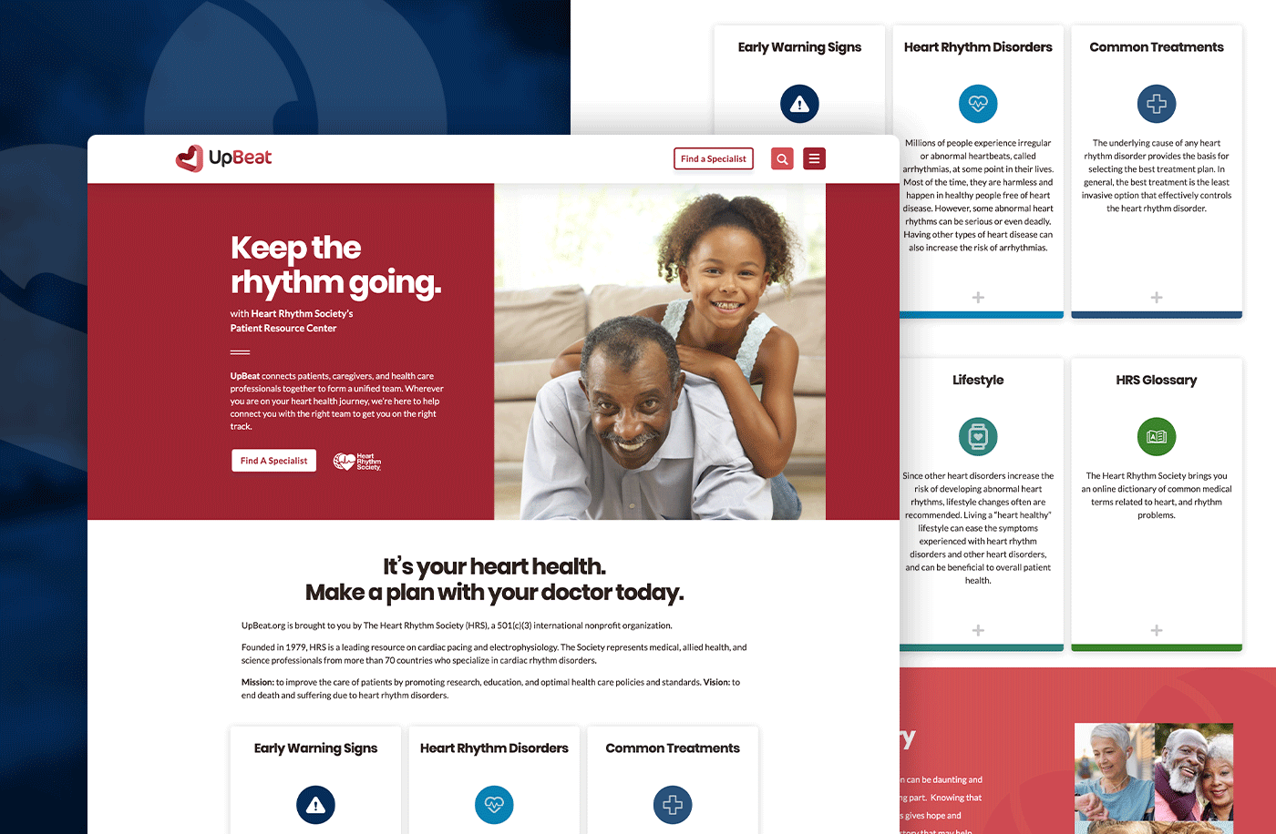
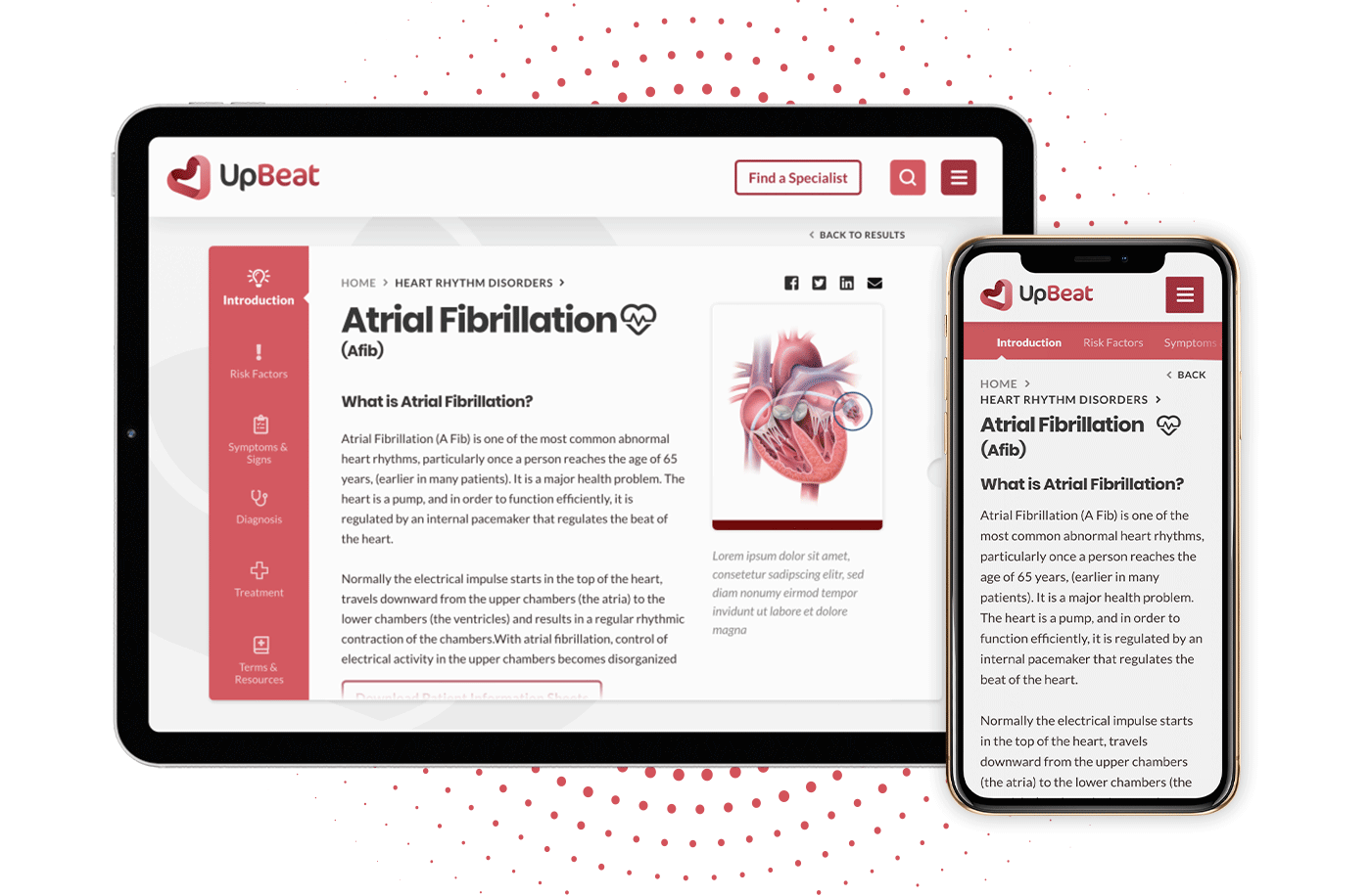
The Website
Last but not least, we designed a website with a slightly older demographic of users in mind. We kept the structure and layout minimal and clean, arranging resources into an easy-to-navigate card structure. The result is a colorful, human-centered site that prominently features images of patients living with heart rhythm disorders and continuing to enjoy their lives and their families.